")

So it’s 2023 and you want to build accessible websites.
Do I?
Yeah.
Because obviously, we want to make content available to everyone, including people reliant on screen readers, people with poor eyesight or motor skills, or the colorblind.
Or, less obviously, people who aren’t familiar with computers or lack the domain knowledge to understand whatever big words you are using.
Or even less obviously, you!! I’d argue that making websites accessible makes the experience better for everyone.
Corporate after their new website passes all WCAG 2.1 Level AA compliance checks
How so?
Everybody loves clean UI and expects websites to behave like all others.
Breadcrumbs on the top of the page that tell you where on a site you are?
Breadcrumbs of the MDN website — one of the better websites out there
Every site should have them.
Form elements you can tab between? Yes, please.
The space jam website from 1996? Yeah, I don’t know, whatever they are doing, don’t do that.
The Web Content Accessibility Guidelines (WCAG) will tell you about all these things; see 2.4.8 Location, 2.1.2 No Keyboard Trap, and 1.4.6 Contrast, respectively. It will also tell you about many more things that seem obvious, like that you are supposed to have a minimum line height for text or that you should put a <h2> tag between <h1> and <h3>. In many ways, the WCAG should be called the Web Content Sanity Guidelines, and we should all be familiar with them.
I can’t tell you how to build perfectly accessible websites, but I can tell you about some tools and resources that will help you in doing so and about some pitfalls that you should be mindful of. Onwards!
Read the WCAG!
W3C’s Web Content Accessibility Guidelines are very well presented and easily understood — one might even say accessible. For every “Success Criterion”, they give links to pages containing further details and examples for successfully implementing it.
As you’re skimming through the page, you might notice that many success criteria aren’t rigorously defined. There’s a lot of room for interpretation and exegesis, making testing for WCAG compliance harder than you might expect.
Tooling
Here’s a selection of tools we have successfully used in our projects to test for WCAG compliance — from automated to manual.
jsx-a11y
Many people will be familiar with the jsx-a11y plugin for eslint, which will catch many common accessibility errors right in your code editor. It’ll, for example, check that every <img> tag has alt-text or that your <html> tag has a lang attribute. That sort of stuff is very easy to check using static code analysis.
Don’t be fooled, however; just because the linter doesn’t complain, that doesn’t mean you’re WCAG 2.1 AA compliant because most success criteria cannot be checked by analyzing just HTML markup.
cypress-axe
Cypress-axe is an excellent tool for doing more in-depth automated a11y checks while your end-to-end tests are running because looking at the actual website using an actual browser opens up many options. In our projects it has caught many color-contrast and nested-interactive issues. (That means it found clickable things inside other clickable things, which is forbidden.)
They claim that axe can find 57% of accessibility issues automatically, which is impressive, but it also shows that manual testing is always required.
Accessibility Insights for Web
For manual testing, Microsoft’s Accessibility Insights for Web chrome plugin has been a godsend. It guides you through manual tests in your DevTools, and you can decide whether you have passed the test or not.
Chrome’s Accessibility Tree View
In the Chrome DevTools settings, under Experiments, you can enable the “accessibility tree view” for DevTools, which will give you a feel for how a screen reader might parse your website, which is excellent for making sure you have sectioned your website correctly, and everything has readable aria-labels.
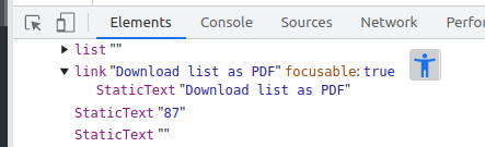
click on the happy lil guy to switch to the accessibility tree
Keep it simple, stupid
Tools that perform automated checks can do a lot of the heavy lifting, but they’re not enough to build truly accessible websites, which is why we, as developers need a base-level understanding of the WCAG.
And it’s a lot, right? It’s a long document with lots of unfamiliar concepts and lots of links pointing toward lots of resources. But here’s a life hack: Focus on building simple but functional UI and writing simple code, and good things will follow.
Remember the motherf-ing website?
While I don’t endorse the language, they’re right about accessibility: Every website is accessible by default. Remember that the HT in HTML stands for hypertext — fundamentally, at its core, every website is just text with links, which a screen reader will have no problem with. Accessibility is not something that is created; it’s something that is taken away.
Of course, not every website these days can look like Berkshire Hathaway’s, so let’s go over some of the WCAG guidelines together :), so we can start building good-looking websites which are accessible too. There’s little point in going over things like color contrast or alt-text because those are the things that your linter will notify you of, so let’s instead focus on some of the less obvious ones.
WCAG 4.1.2: Name, Role, Value
WCAG 4.1.2 is one of the harder-to-understand success criteria and one of the trickier criteria to meet.
For all user interface components (including but not limited to: form elements, links and components generated by scripts), the name and role can be programmatically determined; states, properties, and values that can be set by the user can be programmatically set; and notification of changes to these items is available to user agents, including assistive technologies.
Basically, this means that you shouldn’t be doing anything out of the ordinary. Build UI components that work more or less like their native counterparts. Keep your DOM flat and your markup simple. Only add custom interactivity (==javascript) if you have to.
(Also, use cypress-axe, it helps a lot.)
Here are some examples.
Polymorphic components
Keeping the DOM flat is especially important for those components that you are going to use a lot, as the effects compound. Take a look at this button:
It’s a nice button. It can do onClick and all the other stuff that buttons do. Behind the scenes, it’s probably just a <button>-tag and some CSS.
Though sometimes, you might want something that looks like a button, but actually, it takes you to another website. How would you implement that? I don’t know, lunch break is coming up, let’s just do this:
<a href="example.org">
    <Button onClick={() => {}}>Beam me up, Scotty</Button>
</a>
I know you’re tempted, but resist the urge! Instead, try to think about all the different contexts your button will be used in and give it the appropriate semantics for each context.
Here’s a button that’s sometimes a button, sometimes a link, and sometimes it does nothing at all.
type ButtonProps = InteractiveButtonProps | VisualButtonProps | LinkButtonProps;

export const Button: FC<ButtonProps> = (props) => {
  const { type, className, children } = props;

  switch (type) {
    case "link": {
      const { href, ariaLabel, ariaLabelledBy } = props as LinkButtonProps;
      return (
        <a
          href={href}
          className={`${BASE_BUTTON_STYLE} ${className??""}`}
          aria-label={ariaLabel}
          aria-labelledby={ariaLabelledBy}
        >
          {children}
        </a>
      );
    }

    case "visual": {
      return (
        <div className={`${BASE_BUTTON_STYLE} ${className??""}`}>
          {children}
        </div>
      );
    }

    case "interactive":
    default: {
      const { onClick, ariaLabel, ariaLabelledBy } = props as InteractiveButtonProps;
      return (
        <button
          type="button"
          className={`${BASE_BUTTON_STYLE} ${className??""}`}
          onClick={() => onClick?.()}
          onKeyDown={(e) => e.key === "Enter" && onClick?.()}
          aria-label={ariaLabel}
          aria-labelledby={ariaLabelledBy}
        >
          {children}
        </button>
      );
    }
  }
};

// and later..
<Button type="link" href="example.org">Beam me up, Scotty</Button>
This makes your code more complex but keeps your DOM simple, and screen readers will thank you.
The React component model encourages <div>-soup
As devs, we’re told that leaky abstractions are bad and that we should hide all unnecessary complexity of classes/functions/components from the calling code, which is why I’ve been known to write code like this:
export const Breadcrumbs: FC<BreadcrumbsProps> = ({ crumbs }) => (
  <div className="w-full">
    <ol>
      {crumbs.map(({ name, href }) => (
        <li key={name}>
          <Breadcrumb name={name} href={href} />
        </li>
      ))}
    </ol>
  </div>
);
Around the implementation of Breadcrumbs, I’ve wrapped a small little div to keep things nice and tidy and the component plug-and-playable. The same goes for the Breadcrumb component. This is an anti-pattern: A lot of the time, the additional container won’t do anything useful, and it leads to too many layers in your DOM.
While divs aren’t a problem for accessibility per se, if you nest components eight levels deep, it will add up. And with many layers in your DOM, you’ll be tempted to add a lot of CSS, which will eventually break your website in unforeseen ways and lead to accessibility bugs.
WCAG 2.4: Navigable
Add breadcrumbs. Websites are usually structured hierarchically, and the user should be given a way to know where they are in the page hierarchy and be able to navigate it. If you click through the website using links, your browser’s back button might take you all over the place; breadcrumbs give users a more consistent way of getting around.
Add link indicators if you’re leaving the website so users know which links lead them to content that’s not yours.
Add skip links for larger pages to allow users to skip to the page’s main content, so screen readers don’t need to announce the header section and navbar over and over again every time the user clicks a link.
WCAG 3.1.3: Unusual Words; WCAG 3.1.4: Abbreviations; WCAG 3.1.5: Reading Level
If you are building a website for a client, they’ll likely throw jargon at you that you’ve never heard in your life but that they have been using for years. Let the client explain it and keep note!
Users of the website will be just as confused as you were when you first heard all those words — give them a way to look up what they mean. Provide a glossary if there’s a lot of jargon. Use the <dd>, <dt>, <dl>, <dfn>, <abbr> tags where appropriate.
WCAG 2.1 Keyboard Accessible
One of the bigger challenges for WCAG compliance, especially in more complex user interfaces, is making the website entirely keyboard accessible; no mouse required. You should be able to press tab tab tab and move from the start of the page to the end, without getting stuck, and without tabbing into hidden links or jumping between links in an unreasonable order.
Again, a simple DOM structure coupled with non-fancy CSS makes this much easier. If you’re using hand-written UI components that trigger five animations consecutively, you will run into accessibility issues and get stuck while tabbing. Keep it simple.
Actually, let other people do the work
Understanding and following W3C guidelines is important. But of course, if you use ready-made UI libraries, most of the nitty-gritty details will have been handled already.
Besides the usual suspects (like Material UI, Chakra, and Bootstrap), I want to mention Headless UI, which is a great middle ground if you want to build more custom UI. Headless UI (by the creators of tailwind) is an excellent library for building components that are fully accessible without you having to do deep dives into a11y specifics. The components are headless in the sense that there is no CSS attached; the library handles accessibility, markup, and keyboard navigation while you get to style your components however you wish.
It’s time to build!
We at & invest a lot of time into making sure that our websites are accessible to everyone and that they follow W3C guidelines, as we’re convinced that good UI can make the world a better place ❤️
I hope this blog post provided some insight, though if you’ve any questions, please let me know. :)