
Were you ever given a (design) task and couldn’t help but think, “Why does this feel wrong, even though everything technically works?”
Well, I know that feeling.
I’ve always been drawn to the visual side of tech, since I love the feeling of bringing something to life on a screen. But for a long time, my understanding of design was built on experience, trial and error, and observing what others were doing. A “good design” was mostly just a gut instinct to me, or a vague vibe shaped by personal preference and whatever felt clean or modern at the moment.
That’s exactly why I decided to take the Google UI/UX course. I needed a way to turn design from a vague feeling into something I could actually evaluate, discuss, and build against.
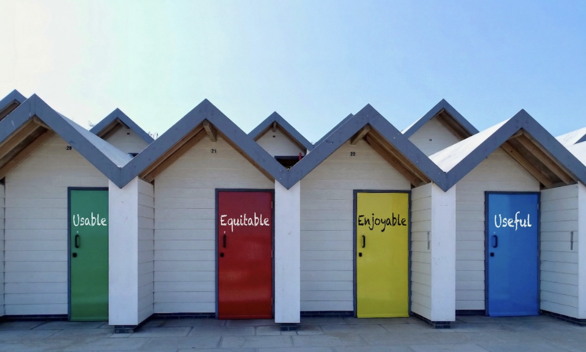
And it delivered! The course introduced me to a framework that I now use almost daily when making design and engineering decisions, and it’s actually quite simple: It describes a good product as Usable, Equitable, Enjoyable, and Useful.
TL;DR
Good design isn’t just a “vibe.” It’s a system built on four key qualities:
- Usable: Easy to understand and navigate
- Equitable: Accessible to diverse users and contexts
- Enjoyable: Feels good and creates positive experiences
- Useful: Solves a real problem
If your product misses one of these, the overall experience breaks down.
But now, let me break it down for you and give you some real-life examples along the way that helped me memorize this system.
The 4 Signals of Good Design
Usable
A product is usable if users can figure it out without needing a walkthrough, a tutorial, or your help in Slack. A usable product makes its structure, purpose, and actions obvious by itself. Users shouldn’t have to decode your interface; they should be able to move through it almost instinctively.
Basically, it’s all about clarity:
- Can users find what they need immediately?
- Do they understand what actions do?
- Can they complete a task without friction?
Example

Probably the best example of this are door handles that require labels. And if you’re like me, you’ve probably felt pretty embarrassed after using it wrongly. But the problem isn’t you, it’s the design! A well-designed door doesn’t need instructions.
In the design world, badly designed doors like these are called “Norman Doors.” They send the wrong signals about how they’re meant to be used, forcing people to guess. A well-designed door, on the other hand, intuitively tells you how to use it just by its shape (for example, a flat plate means push, a handle means pull). If a door needs a written label to explain how it works, the design has failed.
Equitable
A product is equitable if it works well for a diverse range of users, not just the people who built it (or people exactly like them). Equitable design forces us to step outside our own bubble and ask: Who are we unintentionally leaving out?
Designing for equity means considering:
- Accessibility: Can the site be navigated via keyboard or a screen reader? Is the color contrast high enough?
- Differing Abilities: Does it accommodate variations in vision, hearing, or motor skills?
- Different Contexts: What if the user is using a ten-year-old phone, or is an older adult using a walker who needs one hand free just to maintain their balance?
- Cultural and Personal Diversity: Does the language, imagery, and structure translate well across different backgrounds?
Example

Have you ever tried buying a ticket at an outdoor train station on a sunny day? The screen turns into a giant mirror, the text is way too tiny, you’re squinting and using your hand to block the sun just to figure out where to tap next. Add in the fact that it might only take cash or only support the local language, and it’s a miserable experience.
Now, hold onto that feeling of frustration.
That temporary annoyance you feel is a daily, permanent reality for millions of people. If that physical ticket machine is placed too high, someone in a wheelchair can’t reach it. If an elderly person is carefully tapping through the menus, the machine might time out and cancel their transaction before they can finish. Equitable design means recognizing these barriers (whether physical or digital) and removing them so that the experience is fair and accessible for everyone.
Enjoyable
A product can be perfectly functional and still feel empty. If we’re being honest, adding that spark of joy might actually be the “vibe” part after all, which is exactly why it’s my favorite part of the process.
Enjoyability is what turns a tool into something people actually like using. It’s subtle, but powerful. It lives in the details: the way a button responds, how loading states feel, whether the interface acknowledges your actions.
These things don’t change what the product does. They change how it feels.
And that feeling matters more than you might think. Users rarely articulate why they love a specific app or website; they just instinctively decide whether they want to come back or not.
Example

Think about getting a cup of coffee. There are hundreds of ways to improve the taste of your coffee. But watch a proper machine pull a shot. It’s a smooth, rich, mesmerizing pour that visually hypes you up for the sensations that are about to follow. Now contrast that with a breakroom machine that drips and splashes your coffee into your cup. Your brain is biased before you even take a sip. I’m pretty confident that most people would prefer the experience of the first option, even if the temperature or the grind size is wrong.
The exact same thing happens in digital design. When an interface is genuinely enjoyable to use, it builds loyalty.
Useful
Underneath everything else is usefulness. A product has to solve a real problem. Not a hypothetical one or a “nice to have.” A real, tangible need. This is where an important distinction comes in:
- Something can be usable but not useful.
- And something can be useful but not usable.
You’ve probably seen both. A beautifully designed interface that does … nothing meaningful. Or a powerful feature buried under layers of complexity. Neither is enough.
Usefulness is ultimately the reason your product exists. Everything else supports it.
Example

This example almost speaks for itself. Sure, the level of control on a big switchboard is … nice? But is it really?
Now, compare that to a single light switch. It perfectly solves the core problem (usefulness) and already comes with usability and equity built in.
Add a really nice tactile clicky sound, and we’ve got enjoyable covered as well.
Why this matters beyond design
It’s tempting to check those things off as “a designer’s concern.” But in reality, these decisions happen everywhere, especially in engineering: Every time you structure a flow, name an action, decide what to show/hide, or handle an error state … you’re shaping the user experience.
This framework gives you a way to think about those decisions more clearly. It gives you language to question things, to push back, and to improve what you’re building.
Instead of asking, “Is this done?” you can start asking, “Is this actually good?”
Summary
Most teams are very good at building features. But users don’t experience features in isolation. They experience products as a whole, and that experience is only as strong as its weakest part.
That’s why this framework matters. It’s not about perfection in every category, it’s about balance:
- Make it usable, so people can navigate it.
- Make it equitable, so more people can access it.
- Make it enjoyable, so people want to come back.
- Make it useful, so it actually matters.
Using this framework gives you a shared language and a way to challenge bad product decisions.
It’s time to build products
At &, we specialize in UI/UX and Product Consulting to help you bridge technical functionality and human-centered design. Let’s connect to discuss your current interface or to explore how we can help elevate your product from “technically working” to truly enjoyable.
If you have some questions, or input, or want to discuss this topic further, feel free to reach out to me via philipp.stoeger@andamp.io

Explore Our Latest Insights
Stay updated with our expert articles and tips.


Besprechen Sie Ihr Webentwicklungsprojekt noch heute mit unseren Experten.
Entdecken Sie, wie unsere maßgeschneiderten Webentwicklungslösungen Ihr Unternehmen auf ein neues Niveau heben können.
Stay Connected with Us
Follow us on social media for the latest insights and updates in the tech industry.